
about
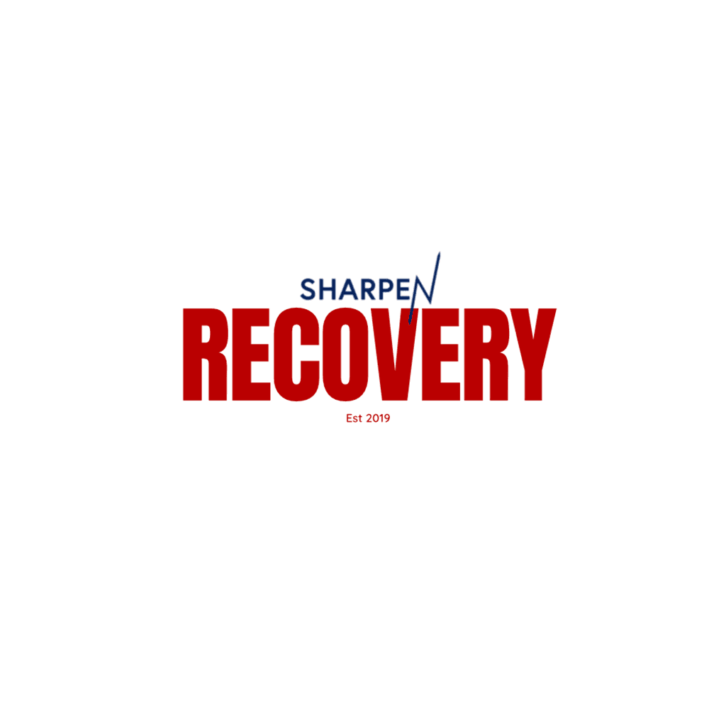
I led a focused brand redesign concept for Sharpen Recovery rooted in a single reframing: we see Participants as athletes in rehabilitation and training. That lens allowed us to move the identity away from generic recovery tropes and toward a posture of strength, discipline, and forward motion. The goal was not to “repackage” the mission, but to give Sharpen a visual and verbal system that matches the seriousness of the work and the dignity of the people doing it.
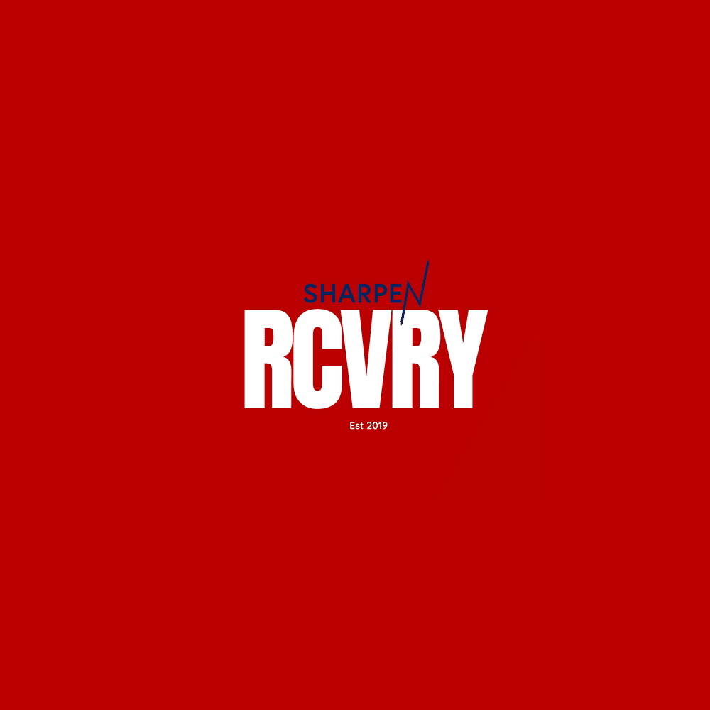
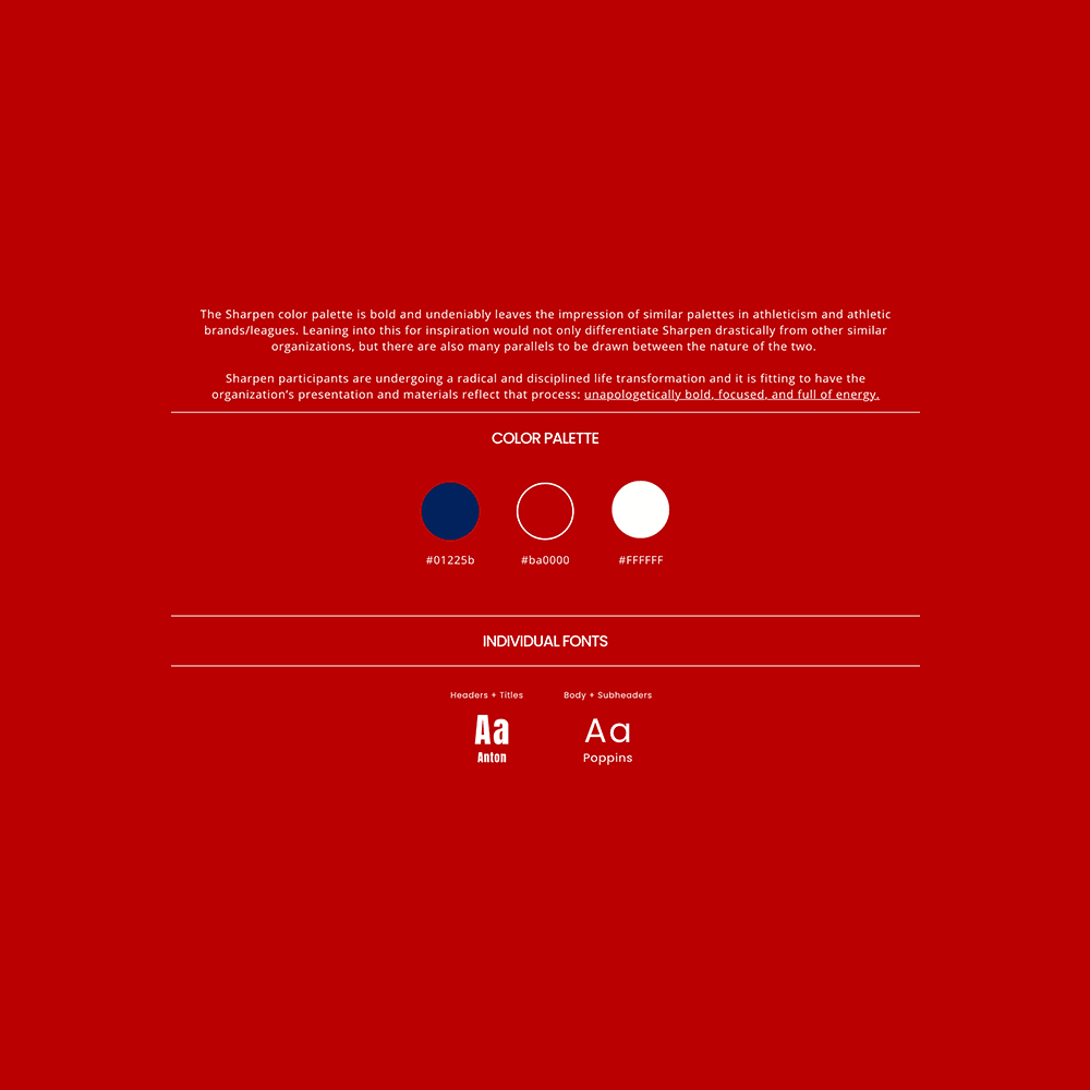
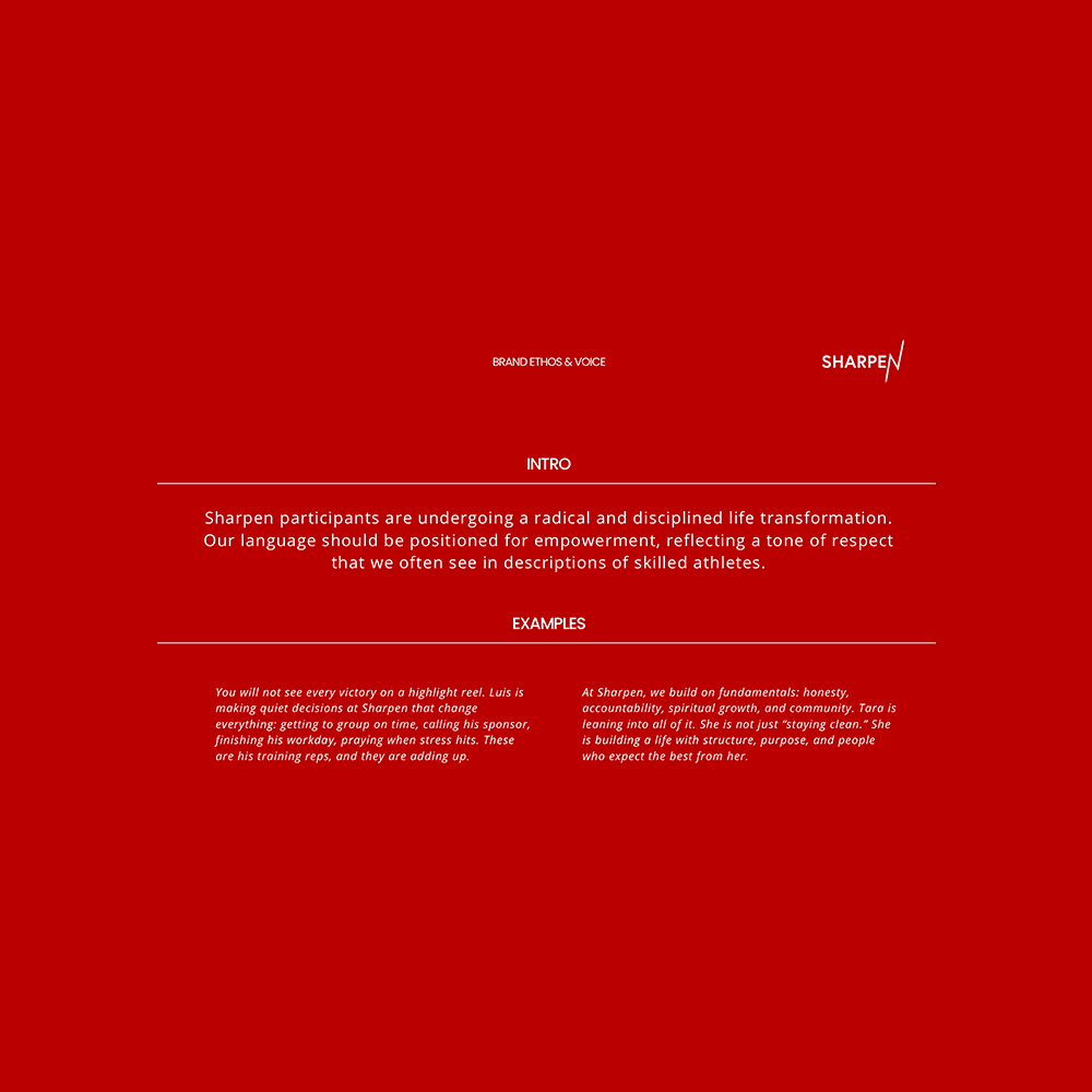
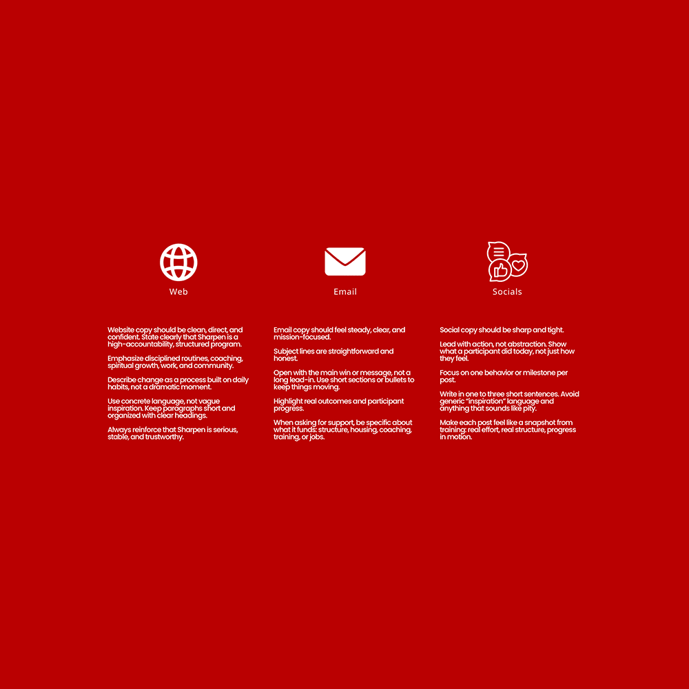
I translated that insight into an identity with clearer hierarchy, firmer typography, and a more structured layout language built for consistency across digital and print. Alongside the visual system, we refined key messaging to reinforce progression: daily practices, measurable milestones, and the steadiness of community. The result is an identity that feels composed and confident, with enough restraint to let the stories carry the weight.
I then applied the system across Sharpen’s core touchpoints, prioritizing clarity and repeatability for a small team moving quickly. Social templates, story layouts, and campaign-ready assets were designed to be deployed without losing cohesion. The redesigned brand gives Sharpen a platform that signals training over crisis, momentum over stigma, and a standard of excellence that honors both the mission and the Participants.
Contributors
Creative Director
Nick Marsella
Other Projects